IRIS is a Bluesight-centric term in ControlCheck that refers to the Individual Risk Identification Score of a provider.
The IRIS Dashboard highlights users whose behavior is unusual compared to their peers by looking across metrics from all analytics enabled at your facility, then creating a normalized behavior profile and comparing each user to that normalized profile.
Each care area has its own IRIS dashboard and calculates scores for each individual dashboard, as well as an overall cumulative score for each user. ControlCheck users can use the IRIS dashboard to narrow down areas of greater risk and focus investigative energies.
IRIS Worklist
We know how important it is for you to determine if a user's behavior is trending in the wrong direction. Early prevention and proactive monitoring leads to the identification of poor practice behaviors and ultimately lowers the risk of harm to your colleagues, patients, and your hospital reputation. Is the user's IRIS score an ongoing problem or is this a new problem? Maybe you've implemented reeducation efforts and want to monitor the effectiveness of those programs for your user cohort.
IRIS includes trending information on a user's rank and score change from one month ago to today to allow you to examine which users have exhibited changes in behavior. Trending data on the IRIS Dashboard will show how a user's IRIS score and rank, i.e. position in the IRIS score rankings, have changed between time periods. This information may highlight interesting patterns including:
- Users whose IRIS scores have substantially increased
- Users whose IRIS scores have substantially decreased
AND
- Users whose IRIS scores have stayed consistently high
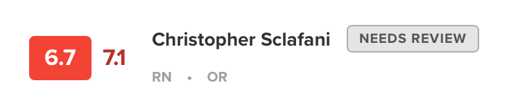
When the IRIS Dashboard first loads, you will see IRIS data displayed on the user cards in the IRIS Worklist, as seen below.
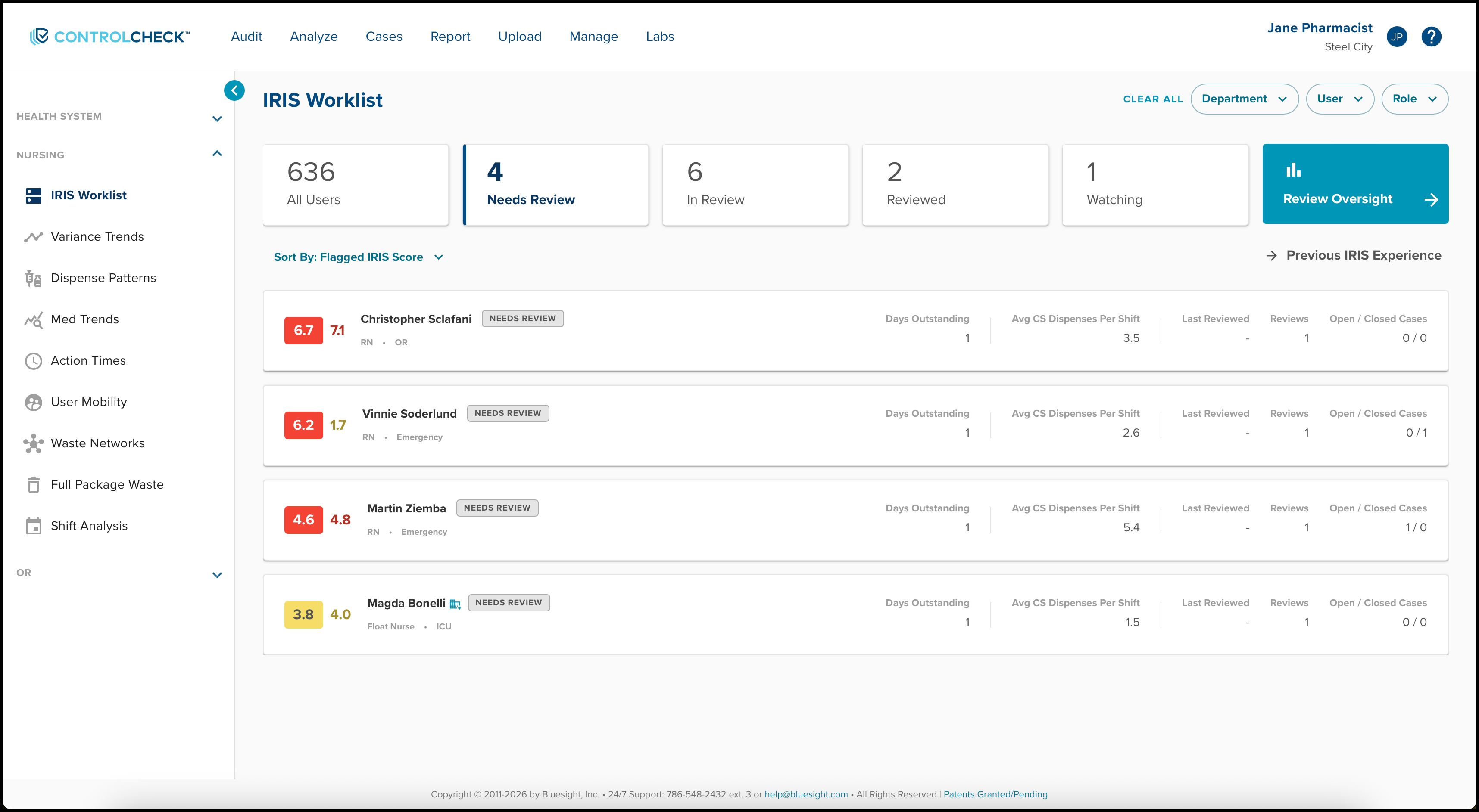
A user's IRIS score determines their rank; users with a higher IRIS are ranked towards the top, meaning the user with the highest IRIS score will be ranked one in the list.
The numbers shown next to the left of the provider’s names represent the overall difference across each of these metrics – if their number is higher, then they are a larger outlier than their peers.
The score enclosed in a red, yellow, or green square represents that users flagged IRIS score. This was the provider’s score when the user was flagged.
The other IRIS score is the user’s current IRIS score based on the last 30 days of data.
Comparing Users Using The Department Filter
Within the IRIS Worklist, department-based scoring is integrated into department selections. The scoring methodology allows you to identify high-risk users and compare their performance with peers in their respective departments.
Department-based scoring is integrated into the selected department(s), displaying users with activity solely within those specific departments. Auditors can examine IRIS users from two distinct perspectives. The selection or deselection of the Department filter directly influences the score shown.

If no departments are selected (the default), all users and their activity across all departments will be compared with peers within the same departments, contributing to the overall hospital score. On the other hand, if specific departments are selected, users and their activity within the chosen department(s) will be compared to peers exclusively within those departments.

Interact with the Dashboard
All users in the selected care area are displayed and sorted by their cumulative IRIS ranking for the previous 30 days, with each user given a red/yellow/green color coding depending on the severity of their score. 
Detailed Risk Score Analysis (IRIS 2.0 Update)
ControlCheck users can select a user's provider card from the provider list (shown above) to view that user's IRIS details, displayed in a window on the right side of the screen (see image below). 
In this window, the provider's name, hospital role, and IRIS will display. You can utilize the 6 Month IRIS & Activity History section to create a benchmark that provides context on whether a provider's IRIS is concerning due to their activities or whether there is an overall department concern.

The IRIS Score graph is calculated and visualized as a solid bar for each month. This is calculated by taking all users who worked within a specific department and calculating the average of their hospital IRIS scores.
Alternatively, the Average CS Dispenses Per Shift/Department Average data is calculated and visualized as a number for each month. This number is calculated by taking all users who primarily work in that department and calculating a simple average of their hospital's CS dispenses/shifts.
In the Detail Risk Score Analysis section, each metric dashboard is listed, along with the selected user's score, color severity compared to their peers, and a brief description of the user's unusual behavior as it relates to that report, if any. Clicking individual dashboard sections in the detailed view will open the selected report in a new tab for further investigation.

Was this article helpful?
That’s Great!
Thank you for your feedback
Sorry! We couldn't be helpful
Thank you for your feedback
Feedback sent
We appreciate your effort and will try to fix the article